Heat Map Analysis
This is a brand new technology which can help to show you what sort of coverage or reach you are getting from your GMB. The technology in this tool is truly ground breaking and amazing. The information it shows can help you decide what sort of steps you need to take if it shows one of your competitors are “eating your lunch.”
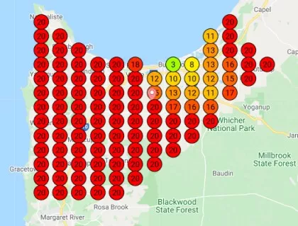
The first map shows visually that the targeted GMB does not have much reach and there is more work to be done.
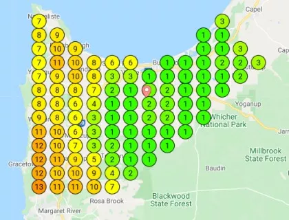
The heat map is a visual representation of how well your business is projected or viewed from 169 (in this instance) positions. The lower the numbers and the more green the better you are viewed, and the more likely you are to be in the 1,2,3 position on the map pack. This means that google has put you at the top of the list because your name or the main keywords you are ranked for has been searched.


The map can be larger or smaller or any shape depending on your selection. Each dot is a separate view of your site and we can interrogate every dot to find out which of your competitors is on top and therefore how to win that area to give you a better and more complete ranking.
The second map shows a much better coverage and notice that there are a lot of 4’s and 5’s. These show that they are just outside the map pack, which means that only a little effort is required to get inside. Remember that being 1, 2,or 3 in the map pack means that 50 – 75% of people looking will choose from these three businesses.
So the areas depicting a 4 or 5 are just money laying on the ground waiting to be picked up, because they won’t take much effort to be converted to a 1, 2, or 3.
If this brief look at “Heat Maps” arouses your interest please contact Leading Edge Web Services and we can discuss your situation.
